Writing sample: Marketplace
Soldo
Soldo is an expense management platform designed to help businesses simplify their spending. Companies create Soldo cards with prepaid balances and spending limits, then assign them to their employees, projects and teams. This lets them manage budgets, spending and reconciliation with ease.
Background
While working with the UX/UI designer to overhaul the integrations section (see the case study here), I delivered the entire writing portion of the redesign.
My goals were to:
Introduce a more marketing-orientated page header and description to reflect the nature and purpose of this new section (to attract new customers, upsell features etc)
Group integrations by type for a cleaner design and better user experience
Bullet point key features for each integration to make content more scannable and digestible
Use clear, concise copy to manage expectations on what is happening (e.g. syncing) or what is about to happen (e.g. after clicking a button)
Introduce an upsell element, highlighting new features not available on the user’s current plan
The copy
Headline
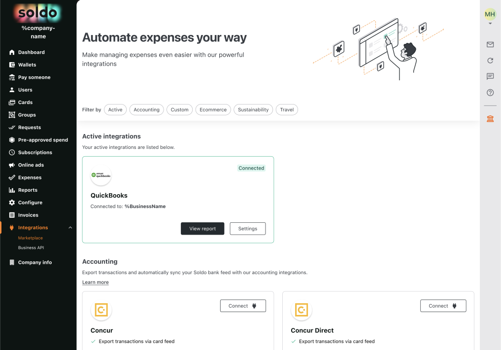
This four-word headline is very hardworking. ‘Automate expenses’ speaks directly to the main pain point of the intended users (inefficient and repetitive expense processes), and offers a solution (automation = easy and efficient). ‘Your way’ suggests a more personalised and considered user experience, easily customisable to suit your needs.
Navigation chips
Grouping integrations by type greatly improves the user experience, by making integrations easier to find, scan and digest. The naming for each group is simple and to the point. The copy balances a need to stay clear and concise, with a need to meet user expectations by reflecting industry and relevant software terminology. For example, using the shorter, more popular and more widely recognised ‘Accounting’, rather than the slightly longer and more outdated ‘Bookkeeping’.
Status messages
The status of each integration is clearly communicated through the copy, and supported by the UI.
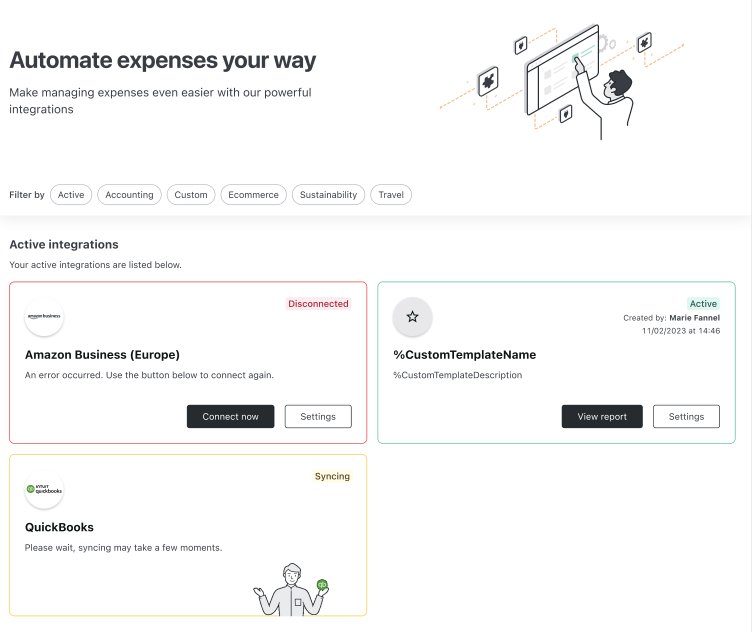
Integration is connected/active:
These cards have a green ‘Connected’ or ‘Active’ badge to clearly indicate success. There is no additional messaging to avoid unnecessary cognitive load.
Integration is disconnected (error):
These cards display a short error message. The message lets the user know an error has occurred, without going into any unnecessary detail. Rather than giving technical reasons for the error that the user is unlikely to understand or be interested in, the copy instead focuses on how the user can quickly and easily fix the problem.
Integration is syncing:
These cards are used when the integration is first set up, and display a short message to let the user know something is happening. Where setup times can vary (but are always short), the phrase ‘may take a few moments’ works to manage the user’s expectations, and makes sense in all scenarios, whether the wait is 10 seconds, under 30 seconds, over 30 seconds etc.
Buttons
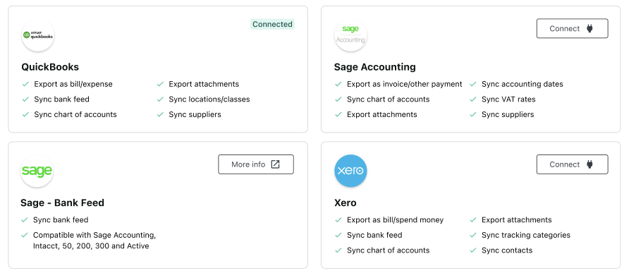
The button copy is clear and concise, and is supported by the icon element. ‘Connect’ is used for integrations where users will go straight to the first step of the setup flow. ‘More info’ is used to set expectations for integrations that can’t be set up from this section, and that require the user to read some additional information and then get in touch with Soldo in order to activate.
Key features
Each card calls out the key features of connecting that integration with Soldo. In the old version of the integrations section, this copy was presented in paragraphs. This made it difficult to scan and harder to digest. Using bullet points presents the copy in a much more user friendly way. Attention can be drawn to key words and phrases, and the content is easy to read and understand.
I kept the language consistent with the software, because users must have an account already in order to integrate it with Soldo. For example, Xero users will be looking to see how transactions can be exported (As bills? Spend money? Or both?) and will be wanting to know if they can sync fields already set up in their accounting software (like tracking categories). Replacing this ‘jargon’ with different terminology would increase the cognitive load, as users tried to decipher the meaning and match the new terminology I’d chosen with the more familiar terminology of the software they were already using.

Upselling
With the redesign of the integrations section, we wanted to try something new. At Soldo, we often release new features onto higher-paid plans only. Those users on lower-paid plans might see some marketing material, but never come across any of these new features within the product. We wanted to see how users responded when shown integrations not available on their current plan, and if this might encourage them to consider moving to a higher-paid plan.
Given the space constraints, the messaging here had to be as clear and concise as possible. The two pieces of information I needed to convey were:
This particular integration is not available on your current Soldo plan
You can click this button to find out more about the different price plans on offer. Clicking this button won’t automatically upgrade your plan or charge you in any way
To cover the first point, I started with ‘Not available on your current plan’. Reading it from the user’s point of view though, this threw up some questions for me, particularly around which ‘plan’ we were referring to. To solve this potential point of uncertainty, I introduced the word ‘Soldo’. I also removed the word ‘current’ to shorten the copy, as it felt redundant.
For the button copy, I played around with more active and impactful CTAs, like ‘Upgrade my plan’ or ‘Give me access’. Although these felt like they might encourage more clicks on the surface, it felt like the wrong way to go for a good user experience. These CTAs didn’t set expectations. They didn't make it clear the user would be taken to a page where they could view all the Soldo pricing plans, and instead implied that in clicking the button the user would be authorising the upgrade and spending money.
To provide reassurance and better manage expectations, I went with ‘View upgrade options’. ‘View’ is very noncommittal, and makes it clear you’re not officially enquiring, upgrading or paying for anything. On its own, ‘View upgrade options’ is quite vague, but in context with ‘Soldo plan’ mentioned directly above it, it feels like a good way to convey multiple messages in a clear, concise and empathetic way.