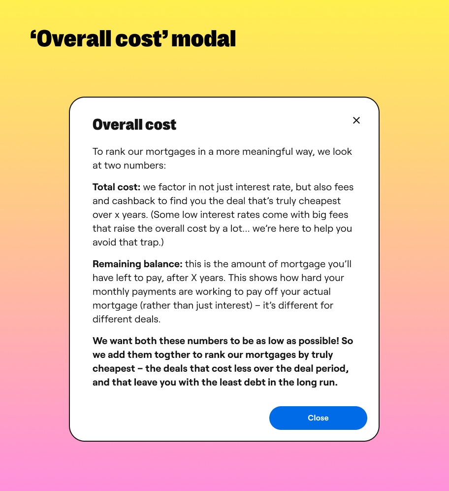
Case study: Overall cost
Habito
Habito is a digital mortgage broker, home-buying service and lender. Customers complete a series of fact-find forms, before being paired with a mortgage expert, who assesses their needs and recommends them a mortgage.
Background
Unlike other brokers and lenders, Habito looks at two numbers when ranking mortgages — the cost over the initial term (including any fees and cashback), and the remaining balance once the term is up. These two numbers are added together to rank mortgages by truly cheapest — the deals that cost less over the initial period, and that leave the customer with the least debt in the long run. We call this the overall cost.
The problem
Ranking mortgages by lowest overall cost is unique in the industry, and is one of Habito's biggest USPs. When I joined the company, it was only being called out at the final stage of the product journey (recommendation), and nowhere else.
In testing of the recommendation stage, users were not interacting with the overall cost explainer modal. After being prompted to open it, they understood the concept, but had no reason to care. They hadn't seen overall cost mentioned anywhere else in the journey, so weren't engaged with the idea, and didn't see it as an advantage of using Habito. As an unfamiliar concept within the mortgage industry, users needed more than a few paragraphs at the end of their journey to make them get on board with, and excited about, this new ranking method. The experience felt disjointed and confusing.
The solution
The first thing I did was change the name. 'Overall cost' was 'True cost' when I joined Habito. Nobody was sure where this name had come from, or what it really meant. Renaming it didn't take away the need to explain the concept to our users, but it did give them more of an indication of what to expect. 'Overall' means taking everything into account, 'True' doesn't really suggest this.
When it came to updating the content, I took a two-pronged approach. First, I updated the final recommendation page, pulling out some of the modal content, and changing the copy for the modal link. I also worked with designers and engineers to move the overall cost number to the left of the page, where users typically look first. Finally, I renamed the number for clarity and consistency (from 'Total cost over X years + Remaining balance' to 'Overall cost').
The second stage involved introducing the idea of overall cost earlier in, and more frequently throughout, the journey, and getting the user familiar with the concept well before the recommendation page.
One of the areas I did this was our calculators and comparison table, as these are used by both transactional and non-transactional customers, and sit at the very beginning of the user journey. Originally, these tools allowed the user to sort live mortgage deals by lowest lender fees, interest rate, monthly repayments or cost over deal period. This didn't tie in with what the user was seeing at the end of the journey, where their mortgage expert would recommend them a mortgage based on the lowest overall cost.
To solve this problem, I worked with the product manager to introduce overall cost as a sorting method for the user, and set it as the default. To prevent users immediately changing back to a more familiar sorting method, I added an educational card to introduce the idea of overall cost, as a way of starting to build recognition, consistency and trust.
I also worked with our copywriter to add an article to our Content Hub, explaining what overall cost is, and why Habito ranks deals this way.
Finally, I updated our mortgage experts (MEs) on everything we'd done, working with them to update any existing email and live chat templates. The MEs are in contact with the user from the moment they complete the fact-find form (sometimes earlier), to the moment they are recommended, accept and apply for the mortgage. By making sure the MEs introduced the idea of overall cost early in the journey, we could set user expectations for what their mortgage recommendation would be based on at the end, and help build a far more consistent, cohesive and trustworthy user experience.


